By Emma Stevens
Infographics are not only a great PR tool but also an effective way to spread information. I recently created an infographic for one of my classes at the University of Oregon and I wanted to share my process.
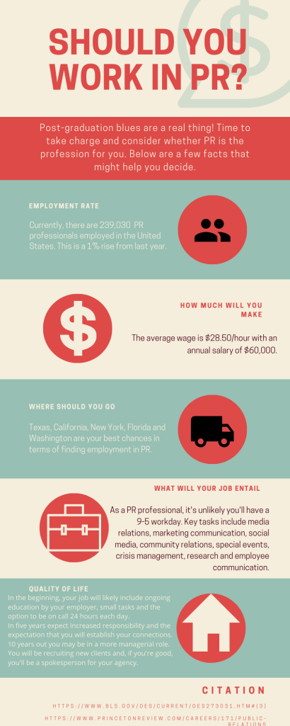
The first step for creating a good infographic is considering the story you want to tell. It took me a while to figure this out, and I even reached out to my teacher for some input. In my rough draft, I ended up spilling out PR facts that did not correlate, nor did they form an interesting story. It is important to remember that an infographic is not just data, but rather an engaging visual that gives your information a backbone. I decided, after getting some great tips from my teacher, that I would help my readers decide if PR was the job for them.
The second step was considering what data was relevant and valid. I used Google and typed in a few keywords: PR, PR employment rate, PR work-life culture. I filtered through multiple types of sources and chose to focus on government and well-respected news sources. Infographics are data and tend to not be opinion-based, I would suggest steering away from blog posts or random articles for your data or facts.
The third step was picking the best data. I used the government source as my top data, focusing on the employment rate and the best cities for getting a PR job. I thought these worked well together and gave insight into the job market and PR’s global scope. I then used a source that gave my readers facts regarding work-life culture and the critical tools you will be asked to use. I believe the infographic flowed nicely and gave readers both data and facts that would be helpful for post-graduation or any type of job searching.
The fourth step was creating a visually appealing infographic. I used Canva, which is a great website for creating creative content. I used a free template and added my graphics and data. I chose to focus on one color scheme with neutral but bright colors. I alternated font colors and added a descriptive title to help my reader understand the story I was trying to tell. Additionally, I focused on making sure it was organized and that the infographic was simple. Finally, I made sure all my fonts were the same size and my text was in line with each other so that the reader’s eyes could easily follow the information.
Ultimately, my goal was to help anyone in the job market consider whether PR is the job for them. I wanted to tell a story and highlight my passion for the PR industry. Take a look for yourself.